

The movie references so many interesting 1960s films. When you guys were trying to create a palette and a cohesive world for this film, were there any films that you felt like if you guys got it right or it looked like this, you guys knew you would be on the right track, or of a piece with those films of that time period?
No, that wasn’t necessarily a consideration. It was more like it’s why you read other work or watch other work. It’s not that you want to emulate something, but you want the spirit of something. You might want the spirit of “Easy Rider.” You might also want to want to step into the spirit of “The Dirty Dozen.” It’s not necessarily that we want to emulate “Bob & Carol & Ted & Alice,” we want to be able to have the spirit of Paul Mazursky’s work, but not necessarily do we want to create that work. You don’t want to create “Wild Bunch.” You don’t want “Blow-Up.” It’s just like we float, and we would talk about things, and if there’s a shot that we love in a movie, then we talk about the shot. If I don’t know the shot, then I go back through the film, and I find that shot that he’s talking about. And it may not even be as he described it to me, but it’s how he recalls it or how he visualizes that shot, whereas I may see it entirely different in my head. But that’s the language, and that’s what you do, and Marty [Scorsese] did the same thing, Oliver [Stone]. All these people, John Sayles, are always bringing in references that you look at and study, and they are how you build a common language so that you can communicate. It’s as if you’re starting each time learning how to talk to somebody and finding a similar language as best you can.
What’s really remarkable is the magic realism of the TV show within the movie. I mean, I don’t know if this was deliberate or not, but the layout of that hotel in the “Lancer” shoot looks the same as the lobby of the hotel in “Rio Bravo.”
Yes!
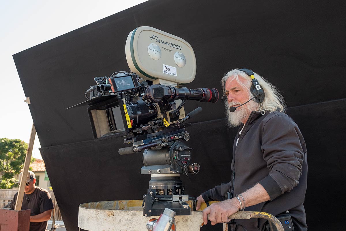
Was there a style bible that existed or you referred to for those shows to match their techniques?
No, actually, with Lancer we went the other way. He wanted Lancer to be his next Western. So he perceived that initially when I first met with him to talk about the script, well before production. He said I’m not entirely certain whether I want to shoot this in 70 millimeter, and I don’t know if want to do the whole film in 70, but maybe I want to do a part of it – and maybe that part is Lancer. And so for him, no matter how we were going to go about the movie, with “Lancer” it was going to be virtually in the same format as the rest of the film because even if it went 70 millimeter, it’s not going to get bigger. It’s still going to fit the same parameters as anamorphic. And then we decided that it wasn’t worth the income and also the lack of capability of doing a zoom if we needed a zoom, which in 70mm you really can’t get anything that works there. So we decided to shoot it anamorphically, both for creative reasons and fiscal reasons. So I didn’t have a bible to shoot to – there was no bible for me. What I tried to do is to create a specific look when you saw behind the scenes that would give you what would essentially be, oh, they use an old camera. But I did overlight in a way that I would not normally have lit that sequence, because it felt like it had to have a semblance of another time when they had to use more light to light actors, because the film stocks were slower. And then with the cooperation of Yvan Lucas, who’s a grader that I’ve worked with on so many films – he did “Hateful Eight” as well as several others with Quentin. But we worked very diligently in doing dailies with Quentin, because all of Quentin’s dailies are initially on film – shoot on film, print on film, view on film, and then it gets transferred as if it’s an exact replica as much as possible for the AVID for editing, and then it’s transferred back out and they recut the negative to get him the look on the film. So with Yvan, we worked very hard in getting back to a level of saturation that’s not common today in the way we shoot movies, and also with grain structures.
One of the things that stands out about the film is just how vividly you guys create what feels like a real sense memory of that time and place, whether or not it actually looked that way.
I did too, but also it’s not just us. For example, if we don’t have good production design, we don’t have a good looking film. If we don’t have a good costume, we don’t have a good movie. If we don’t have good hair and makeup, we do not have a good film. That was so vital in this movie, the collaboration of so many people to achieve one goal. It’s not simply between myself and Quentin and the visual of the camera. The camera has to record something and if that’s not put before the camera, if not going to be successful.
 When as audiences we watch a filmmaker work with a cinematographer for many years and collaborate many times on different kinds of stories, how challenging is it for you to start from a new place and not slip into the same habits repeatedly?
It’s a good question, and with each director, it varies. Collaboration is about understanding what the project’s about. It doesn’t matter which director you’re working with, not every film that they do is going to reflect the previous film that they’d done. And with Quentin, you listen to where he is, what he wants, and Quentin is a very color-minded individual. He loves color. I mean if you look at “Kill Bill,” you don’t have cars that are that bright yellow for a reason. You don’t have outfits that look that color. Nothing in our world is the way he does it, and that’s his love. He loves deep, rich, almost poplike sensibilities in terms of color. And in this film, he didn’t go that far. For example, when you watch the costumes of which I think Arianne [Phillips] did an extraordinary, brilliant job and Barbara [Ling] as well in terms of production design, the colors don’t reach out and stab you. For example, Musso and Frank’s had been built, and it could have been a much poppier red, and the wardrobe could have been far more enhanced if someone were searching for that goal – but they weren’t searching for that goal. And if you look at some of Leo’s work, his costumes I remember him saying, Quentin, I look like sherbet, because tonalities were all in the sherbet zones – and he looked wonderful, like so good and so much of the period. But it takes a lot. I mean, you change hairstyles like that and makeup like that, that’s a great pleasure. I mean, with Marty, I walked into “Aviator” having to create a three-color look, a two-color look, and I studied so many different versions of color and how to create them with look-up tables, because you can’t get those anymore. There are many variations, the brown level, et cetera, so you become an expert trying to find these places. And then I create those look-up tables with people – obviously the scientists – and then I utilize them in in digital palettes, for various reasons.
So much of your best-known work has this very saturated, lustrous, contrast-y feel to it. But even on something like “Repo Man,” it’s noticeable. What has consistently drawn you to that style, and why do you think that has been the best technique or style to bring the stories that you’ve worked on to life?
That’s interesting. It’s tough to say – why do you write the same way you’ve written for so many years? I can’t say that I think I do, because I don’t have a way to look at myself from the outside. I see what I do, like when I did “A Private War,” it was a digital $9 million movie with no lighting, 37 days, and it has nothing of the saturation I’d been dealing with in a film like this – or “Breathe” or “Adrift,” the last three I shot prior to this film. And I look at it, and I go, yeah “Hugo,” we absolutely locked down, and that was because Marty [Scorsese] and myself were learning how to step into the process of shooting 3D in camera. But I think maybe it’s because the film as an art form prior to very recently has more saturation, and it’s not something you can avoid – unless you want to strip it down to something that is more black and white. For example, that when I did “Platoon” with Oliver [Stone], I did a combination of color and black and white stock bypact for a test for him because I liked the feeling of bypacking a black and white film at 30 percent on top of 70 percent color and what it did. He didn’t accept it, but I’d liked the feeling of that because I thought we had too much color – too much green – and I wanted to shift it throughout the film to vary the amounts of color and black and white. But the technique was costly, and it caused a lot of issues, and it was an extraordinarily small amount of money we had on the film, so we didn’t do it. But I guess you’re right – perhaps there’s more color in many of my movies; I mean, “Casino” is certainly is an example of a lot of color, that IB technicolor. But then again, what is better than IB technicolor?
“Once Upon A Time In Hollywood” is open in theaters nationwide now.
