

Well, would you look at the date? It’s the first of December, which means we’re going to start looking back on all the great stuff 2016 has brought to us at the movies. And like the considerate film lovers we are, it’s a process we’re kicking off in gentle, colorful style by running down the best in movie posters.
Since we’re not limited to films that have already opened, just to posters that have appeared since January, there are a couple of teasers for films not yet playing included below. Overall, though, it feels like it has maybe been not quite as great a year for movie art as last year, or the year before, but there were still plenty of memorable print campaigns adorning films deserving and undeserving throughout the past 11 months. Here are our 20 favorites.
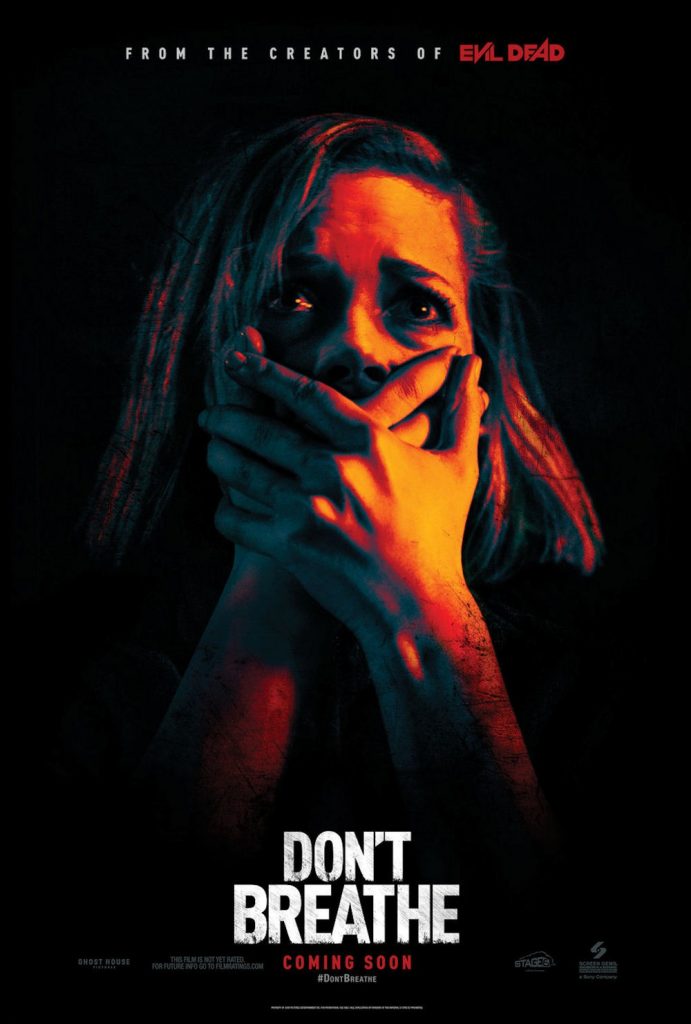
20. “Don’t Breathe”
Simple, punchy and instantly communicating the above-average scare quotient of Fede Alvarez‘ home invasion horror-thriller, this design by LA powerhouse The Refinery also subtly harks back, in its bold block colors, 70s-grittiness and distressed typeface treatment, to the posters for Alvarez’ “Evil Dead” remake. So even without the “from the creators of” bit at the top (which not all executions have) horror aficionados were being subconsciously cued for what to expect.
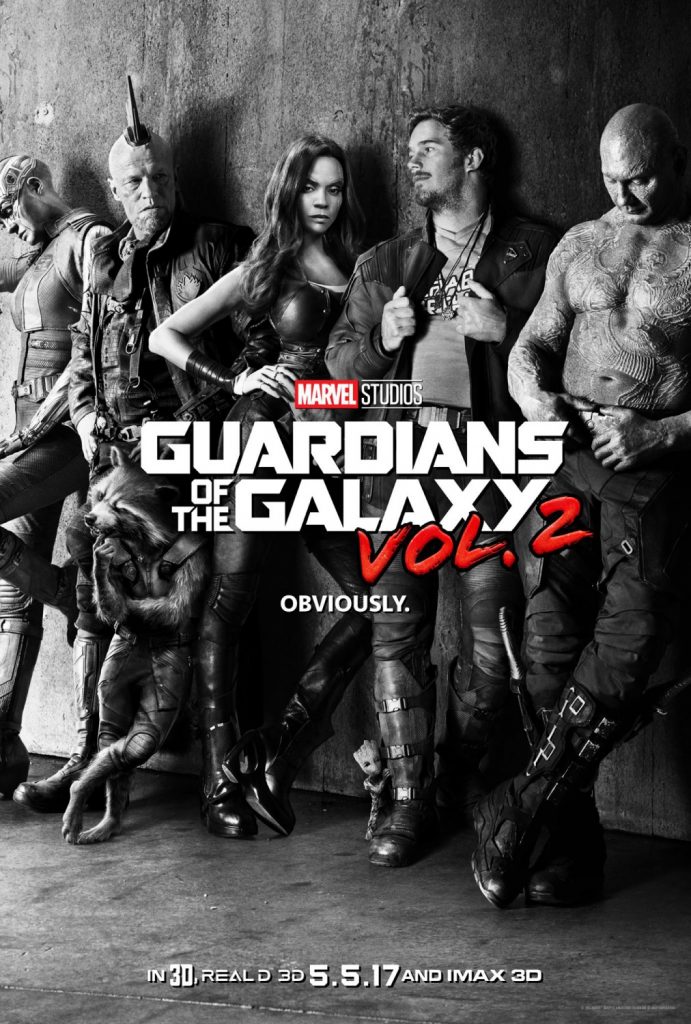
19. “Guardians of the Galaxy Vol. 2”
It really is easier for a camel to pass through the eye of a needle than for a blockbuster poster to make it onto this list — mostly such marketing, while effective, is so much wallpaper. But last year’s witty poster for “Ant-Man” did make it on, and now, from the same design house BLT Communications comes this poster for the follow-up to James Gunn’s 2014 hit. It’s “only” a teaser, of course, but the black-and-white, album-cover image and the general air of sulky disaffection puts us right back in the mood for out next outing with StarLord & co.
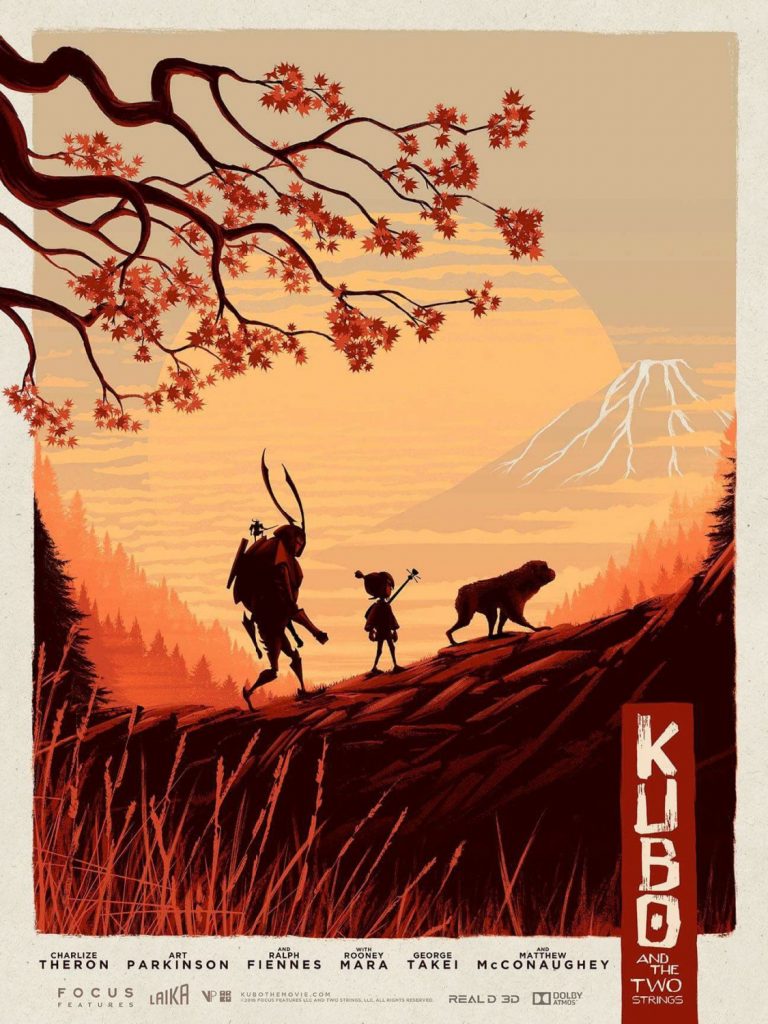
18. “Kubo And The Two Strings”
It almost feels like a cheat: designer Matt Ferguson (who was also behind these very nice alternative “Doctor Strange” posters) had one of the most beautiful films of the year to work with, so of course the artwork would also be beautiful. But his lovely work for the Laika title goes one better than simply replicating the film’s style, and, in the Japanese-style title treatment, controlled palette and perfect composition, he creates an evocative, instantly frame-able illustration, masquerading as a movie poster.
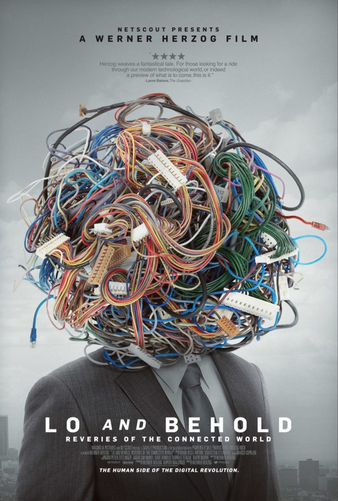
17. “Lo and Behold: Reveries of the Connected World”
It’s hard enough trying to make the internet seem cinematic over the course of a two hour film, let alone a documentary, and distilling it into a memorable single image is another level of difficulty by itself. But P+A (Percival and Associates) rose to the challenge in fine style with their campaign for Werner Herzog‘s foray into cyberspace, and this image is the cream of the crop — witty, clean and a little dystopian, it’s engaging without compromising at all on the film’s cerebrality.
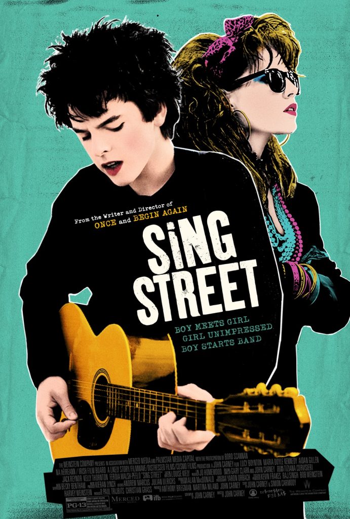
16. “Sing Street”
Boutique design agency Leroy & Rose do a lot of promo campaigns for TV shows, but also made a colorful splash with their affectionate and appropriate campaign for John Carney‘s 80s Dublin-based indie musical hit. Riffing with unerring accuracy on the iconography of the 1980s Irish band scene — if anything this secondary poster goes even further down that road — this bright, poppy retro design perfectly encapsulates the nostalgic energy of the movie.
