

5. “The Lighthouse”
Ominous symmetry, blinding whites, and choppy waters color the mystery of Robert Eggers’ maritime madness that is “The Lighthouse.” Two men are tasked with taking care of the title establishment – and it all unravels from there. Poster-wise, there’s playful balance across a triptych of designs. The first draws an attractive picture of the film’s namesake, as waves crash and a mermaid’s tale can be spied diving deeper. The next one frames two men, reduced to profiles, looking up into the distance. “Keeping secrets, are ye?” the subtitle asks, as Hitchcockian birds swarm, and the building remains out of focus, unlit. But the most curious design, the third product from powerhouse designers P+A, gives microscopic detail to one of the film’s supporting characters. That seagull. The troublemaker, the nightmare, perhaps one of the two men’s conscience. The rest is pitch black. If there was ever any doubt as to the limit of the madness of this word, the seagull poster answers it. The limit does not exist. – EK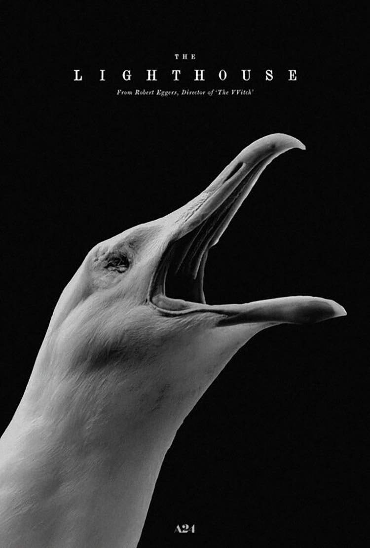
4. “Monos”
In “Monos,” you’re just as likely to get burned by floating embers of a wildfire as you are to drown in overflowing rivers. It’s a hallucinatory nightmare in the best way possible: eight teenage soldiers are tasked with surveilling a hostage, and a milk cow named Shakira. Things spiral out of control, naturally, but director Alejandro Landes never drops the ball. The posters, designed by Nicolás Muñoz, capture this paradoxical astonishment. In the first version, the out-of-focus shadow of Moises Arias (remember him from “Hannah Montana”) is howling up to the sky. Specks of fire dance in the air, the heads of his mates bob above the water. The marketing visuals, like the film itself, emanate a kind of heat that’s intimidating rather than warming. Danger is never far away. To show how something is always ever so slightly off, there’s a brilliant deal on one of Brouwer’s variations. The kids are still in the water, and they’re looking up to the sky. But the source of light isn’t the sun. A raging red circle, trailing smoke, takes up space among the clouds. It’s a flare, crying out for salvation. – EK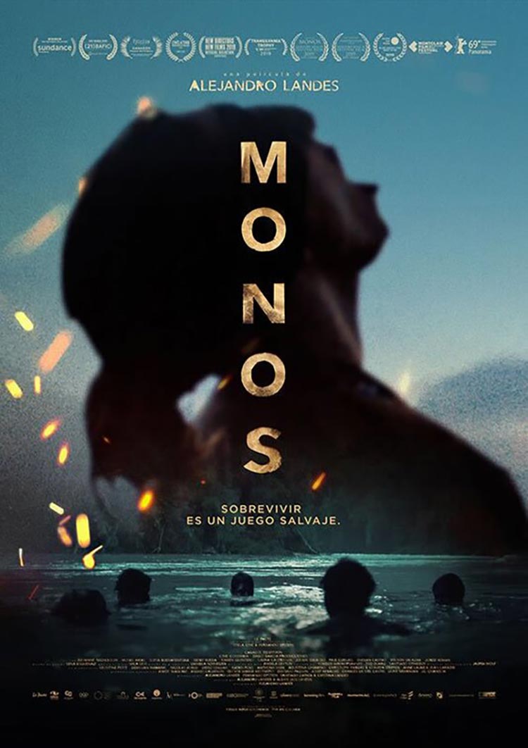
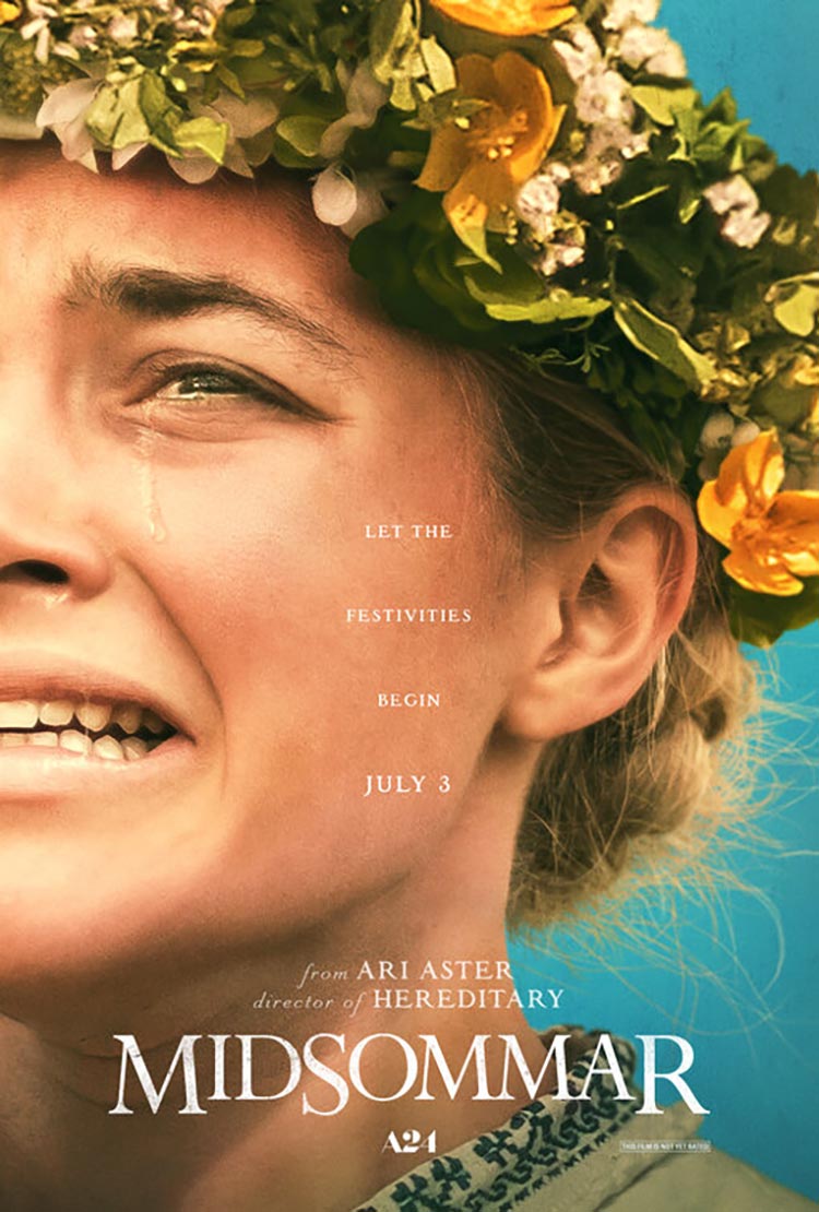
3. “Midsommar”
There have been several films this year striving to capture the danger that can lie behind a happy veneer – just ask the Clown Prince himself. But Ari Aster’s “Midsommar” is invasively bright and inviting from every angle. There’s nowhere to hide in the endless sun of the Midsommar season in Sweden. Florence Pugh completely carries the film as Dani, a young woman tagging along with her bumbling boyfriend and his friends on a “guys trip.” The poster perfectly captures the film’s paradox of pain: the sky is blue, her skin is golden, flowers fill the top third and the fabric that is visible is that of an airy, festive blouse. But you don’t need the entire face to see the searing panic in Pugh’s face: the slanted eyebrow, the watery eyes, the wet nose, the panting mouth. It’s all there – it should be bliss, but it’s hell. Such is the brilliance of this nightmare. – EK
2. “Ash is Purest White”
The story of Jia Zhangke’s violent, sprawling action feat spans 17 years and sees countless strands unravel, get cut short, and float in the air. Zhao Tao stakes her claim as one of our generation’s all-time greats, in a cacophonous world that threatens to stifle her. The Office Kitano poster seems to tell an entirely different story: a tall, lavish setting, diagonal lines of staircases and verticals of light fixtures create the backdrop, while a couple dances in the shadows. They’re not necessarily dressed for the ballroom, they’re not looking at each other. This doesn’t seem to be the place for it – and yet this puzzling, almost drop-in-the-ocean happenstance is what offers the most searing indication on the film’s humanity. However many people lose their lives, there is shelter somewhere. And where there is shelter, there is room to dance. – EK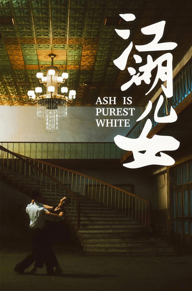
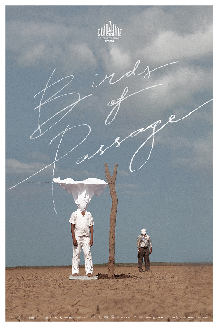
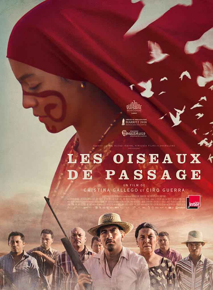
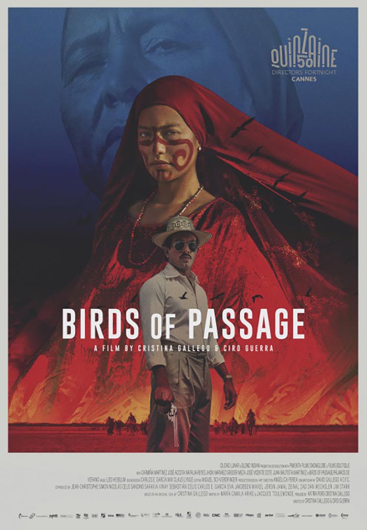
1.“Birds of Passage”
Remember the name: Dan Petris. The artist has been quietly making some of the best alternative posters for years, from “Beach Rats” to “BPM” – so it’s incredibly satisfying to see his name under the stunning designs for Cristina Gallego and Ciro Guerra’s heady war picture “Birds of Passage”—all of them so damn good, it’s hard to pick one, but this pick sort of becomes the cumulative #1. The plot details are dense and complex, as rival families start a war amidst the violent marijuana period that saw the origins of drug trafficking in Colombia. The posters follow on the immense colors of the indigenous families’ traditional dressing, as well as the vast expanse of blue sky in the desert where the war takes place. The Directors’ Fortnight poster from Cannes that sees three layers (the dusk blue, the swathes of red, the man with a gun, dressed in beige, at the center) is a standout design, but there’s something utterly breathtaking about the alternative poster that sees the girl in red stand opposite the topless man, looming down at them. Above them? A handwritten white scrawl of the title, and a soft triangle of birds, fleeing as quickly as they can. – EK
Best/Worst poster
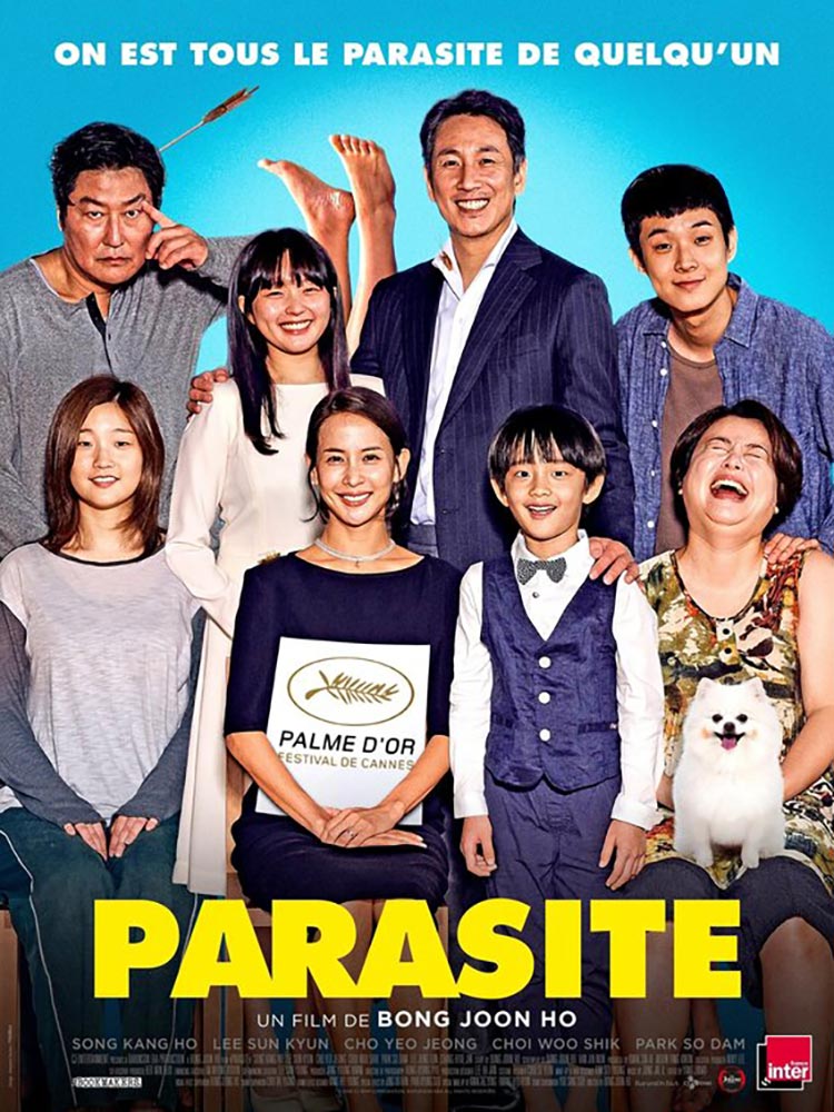
“Parasite” is a film best appreciated with as little prior knowledge as possible when going into it. It’s a deeply intelligent and dark tale of shifty social structures and shady families – so everything about this French poster is, well, just wrong. The two families blend together confusingly, smiles are excessively frozen and eyes look unfeeling. It’s staged like an oddball comedy, the sky-blue backdrop and sunshine-yellow block letters are mocking. There are so many elements that don’t make sense. The French photoshopped dog, definitely not photographed at the same time. The unevenly cut white sign boasting a Palme d’Or win. Is it supposed to be on her dress? Is she holding it? And what is happening with the upside-down feet, perfectly perpendicular? It’s a nightmare, top to bottom. But not the rewarding kind.
Honorable Mention
As ever, in a year so rich in stimulating movies, there are plenty of posters left to admire that deserve their own shout out. The glowing orb of “Ema” is a vision that won’t be forgotten for a long time, nor will the angelic gas balloon floating among the clouds of “The Aeronauts.” Genre movies offered ample cause for visual celebration, from the stripped-back intimidation of “It: Chapter 2” to the colorful hodgepodge family of “Knives Out.”The geometry of “The Art of Self-Defense” certainly earns a nod, while the hallucinatory color scheme of Harmony Korine’s “The Beach Bum” poster fittingly encapsulates the heady atmosphere of the film. Elsewhere, both “The Farewell” and “Toy Story 4” cram all of their major players into one frame with well-populated and colorful posters – one leaving the background bare, the other embracing the loud rainbow-colored chaos of a carnival. There’s some pretty effective typography on “Jojo Rabbit” and “Dolemite Is My Name,” and nature is embraced in the blues of the sea for “Waves” and the burning orange sunset for “The Lion King.” Chalamet does his job and looks moody for “The King,” Tom Mercier bursts onto the scene with a close-up for “Synonyms,” as does Shia LaBeouf for his cathartic memoir “Honey Boy,” posing better than ever before.
