

Director Kate Herron and head writer Michael Waldron pulled off something quite remarkable with Marvel Studios‘ “Loki.” The Disney+ series not only set the popular character on a new and compelling narrative but did so with arguably the most gorgeous and creative aesthetic in the MCU to date (although the work on display in Chloe Zhao’s “Eternals” is right there with it). Much of that was due to Herron’s vision and the unique talents of cinematographer Autumn Durald and production designer Kasra Farahani.
READ MORE: Kate Herron stalked Marvel to get “Loki” and we are the better for it [Interview]
Although not household names yet in Hollywood (yet), Durald’s lighting and camera skills will be on display in “Wakanda: Forever” in November, and her previous credits incredible work on films such as Max Minghella‘s underrated “Teen Spirit” and Ry Russo-Young’s “The Sun is Also a Star.” Farahani is no stranger to Marvel having worked as an art director on “Captain Marvel” and he’s already won a prestigious ADG Award for his work on “Loki.” Both creatives are hoping to earn their first Emmy nominations next month.
During our interview, the duo discussed working with Herron, the show’s aesthetic inspiration, their favorite sets, and whether any of those gorgeous creations might return for season two.
_____
The Playlist: First question, easiest one, how did this come your way?
Autumn Durald: Kasra signed on before I signed on. So, when I came into the mix, I was meeting with the producer, and Kate and I had heard about it through my agent, but I think after the fact, I think Kevin [Wright], the producer, mentioned how it really came my way and so, I just had a great meeting and we hit it off and had a lot of the same references and she was really personal in the meeting and we got along and then she introduced me to Kasra and it was a great fit.
The Playlist: How about you Kasra?
Kasra Farahani: Similarly, I heard about it from my agent, and I had worked on some Marvel stuff before as an art director and as an illustrator, but not as a designer and this one just sounded fun because it just seemed like it had the potential to be going in a new way from the other, that hadn’t been explored yet.
The Playlist: There are always conversations on studio or network projects, “oh, we want to go in a different direction”, and sometimes it just doesn’t happen that way because execs or producers say, “no, no, be more conservative”, or whatever. When did you guys realize, “Oh wow. They really are going to let us play in the sandbox and have fun?”
Kasra Farahani: I don’t know what you think, Autumn. I feel like it was pretty early on.
Autumn Durald: I’m more naive than maybe Kas because he had worked for Marvel before and this was a whole new territory for streaming. So, you thought, “oh okay, well the references are all dark and no one’s saying it can’t be moody, and architectural, and stylish.” So, I was always under the impression that we were going to be good, and then as he started sending in his references and no one’s saying, “change them”, I was cool. I mean, what do you think Kas?
Kasra Farahani: I think that, that’s right. I mean, honestly, it happened pretty quickly, because we had Marvel, there’s frequent, weekly, at the time it was weekly, check-ins with the studio about all of the art and what directions we were pursuing in the visuals and to our great happiness, there was right of way, there were no red flags. They’re were like, “yeah, cool. Keep going”. That was exciting, and then it just kept waiting for the other shoe to drop and it didn’t and we just got to do our own thing.
The Playlist: Did you feel like there was one reference or one that you had to stick to regarding the aesthetic overall?
Autumn Durald: Well different maybe for me, but no, I think we had such strong references visually and Kate was so on board with my aesthetic and Kasra’s aesthetic and I took the lead after I saw his renderings as far as light and framing for architecture. But I feel like we had strong references, Kate and I, as far as films and photography that we all always had those in the back of our mind, but since those references are our favorites, they’re our taste, our favorite style of genre to work in, it wasn’t like I stuck to anything, but they were always in the back of my mind.
The Playlist: What about you, Kasra?
Kasra Farahani: I think that’s right. I think a big part of why the show looks the way it looks, is because the rare thing happened, where Autumn and my own sensibility, and Kate’s sensibility, having never met each other, were just in sync. People say that stuff all the time, but it was truly the case this time. And I think, in terms of the design, my approach, which I think bleeds into some of Autumn’s own views, is to not treat it as fantasy, but to treat it more as grounded, and at times, even period filmmaking because the material is inherently fantastical, you don’t need to characterize the visuals unnecessarily with that, because it’s baked in. I think something we all together found and tapped into is the nice contrast of our grounded visuals with that fantastical narrative stuff.
The Playlist: But there’s a color scheme to the series at least to certain parts of the world. There must have also been certain rules like, “O.K., we’re going to try to avoid flares” you were trying to adhere to?
Kasra Farahani: Absolutely.
Autumn Durald: Definitely not flares. I love me some flares [though]. To speak to what Kasra said, the other thing, I think, we did strongly adhere to, was trying to keep as much in-camera realistic as possible, whether it’s set design or lighting, or whatever we could to keep the space feeling as real as we could. Obviously, there are moments in the series where you see it’s heavily the effects, but that was something that was always on my mind. Kasra took the lead on that in his designs, trying to always help out and give us foreground, background, and stuff, to seam certain worlds together. I think what you were saying about the flares thing, I think the color story stuff we talked about in prep a lot, and it was always a discussion, and Kate would have ideas and Kasra would have ideas, and then we would get together and test some of them with our camera and go over that color story, but it was never baked in from the beginning. “This has to be this color and we’re doing it, A, B, and C throughout the six episodes.” It was always a discussion and it came from an emotional place and then also design-wise with his renderings.
Kasra Farahani: Yes. And I think you’re right, there were absolutely some references architecturally and a lot of that came from, just as Autumn said, it’s inherent in the story, which is about bureaucracy and tedious, unnecessarily, complex “Rube Goldbergian” sort of logic of the TVA. So, the way architecturally that was expressed, was by contrasting some of the monolithic architecture of Buddhism and Eastern European mid-century modernism in terms of the scale and the big, heavy monolithic quality of the shapes, contrasting that with the bright colors and warmth of West coast, American mid-century modernism. So, you get this weird contrast of this oppressive, heavy, bulky proportions with this veneer of happiness, which is very TVA. That’s very informed by the narrative of it, where, outwardly it’s stylish and the finishes are pretty, but the organization is a labyrinth, physically and logically. That’s sort of the idea.
The Playlist: Knowing those were the things you had been focusing on for most of the series, what made you go in the opposite direction for The Citadel set in the final episode?
Kasra Farahani: Honestly, there is precedent for what we did in the comic. In the comic where you see the Citadel, it is this castle-ly-looking structure built on an asteroid. So, we did sort of get that basic starting point from the comic, but Kate had a strong idea that it should feel lonely, and she kept talking about Xanadu from “Citizen Kane” and so, that’s where we jumped off is that, it’s this big castle on top of this asteroid, but we came up with this idea that it was actually carved from the asteroid, that there were no other materials that were brought in. I’m sure you’ve seen images of Petra in Jordan of this beautiful piece of architecture that’s carved into the cliff face. That’s the idea, but on this asteroid.
The Playlist: Was there any specific, either set or sequence that you worked on that you’re most proud of?
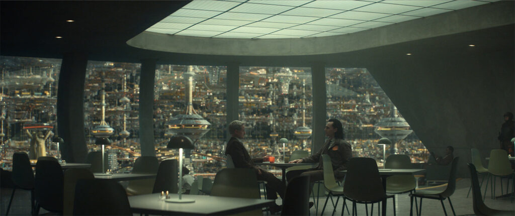
Autumn Durald: I actually adore all the sets and I think, some of the more constrained environments, where you have two people talking and it’s very subtle, are my favorites, because, I think, in this whole discussion I’ve been talking to a lot of people and they like all the camera movement and the energy shots which I loved, but I was really blown away by the Time Theater, I think it was one of the earlier sets we had, right, Kas?
Kasra Farahani: I was impressed from the moment I saw the design, but it’s kind of my aesthetic. You have high ceilings, the lights coming from the ceilings, we had real ceilings. I like a play of soft and hard lights, so you get that in that space. The concrete walls have texture. As far as a playground to shoot, for me, I love that set, and it wasn’t ever like, “Oh, we pulled it off”, I think, I was just impressed, after getting there with how real it felt and how it felt like the sun was really in that space and I think when you can pull that off, it’s nice to have actors walk into a space and go like, “S**t, this isn’t a set”. That kind of speaks to what you’re saying, I think. If you can impress people by walking on a set and they don’t feel like it’s a set, I think that you’ve done something good.
Autumn is being very kind, because it’s a pretty important part of why that set looks as good as it does, is because of the way Autumn shoots it, which is, she has this very distinctive, very wide, low angle coverage, where you, at times, see the ceiling, as much or more than the floor and if you’re a production designer, you love that because you get so much scope, and it’s not an easy thing to do, to do much coverage, so wide as Autumn is so good at doing, and I think it’s a really big part of why the show looks the way it does, is the interplay of the sets in Autumn’s style of shooting.
The Playlist: All the sets, especially the TVA sets, are so beautiful. Did you have to tear them all down?
Kasra Farahani: No, we saved some and we smashed some and you make your best guess on what’s going to maybe have a chance of being reused and what’s easy to store and what isn’t.
The Playlist: So, some of them are still there maybe?
Kasra Farahani: Maybe. Some of them are saved. Well, here’s what I could tell you, some of them were saved, remains to be seen if they’re used but some of them are.
The Playlist: the Void with all the different Lokis looked like it was partially shot outside. Was that the case or was it all interior?
Autumn Durald: No, that wasn’t outside, unfortunately. We wanted to go outside to shoot that and just schedule and everything that comes about when you’re trying to fit a bunch in a small amount of time. That was actually shot inside and on a stage, which was great because we pulled it off and it was a big setup for Kas and I, and we spent a lot of time in there, but we had to just cheat a bunch of stuff. I mean, he had set dressing, cheating different angles, and acting like they’re traveling far distances, but was really one stage. I don’t remember how big that stage was, but it was very frustrating to have to cheat stuff, but we pulled it off.
“Loki” is available on Disney+.
